
The Sponsor Report that survives the finance team
Impressions and footfall estimates don't survive a CFO review anymore. Here's the sponsor report structure that gets renewals approved.

Picture where your sponsor report actually lands. Not on the event manager's desk. She already likes you. It lands in a budget review, next to a paid search report with cost-per-lead to two decimal places, in front of a finance partner who has never attended your event and never will.
That's the audience your sponsor report needs to convince. Yet many reports still walk into that room with “estimated 5,000 impressions from main-stage signage” and a collage of booth photos. Those things may have a place in the story, but they don't do much when someone is trying to decide whether the sponsorship was worth renewing.
We covered the bigger strategy of turning sponsors into a measurable channel separately. This post is narrower: the report itself. What goes in, what stays out, and how to structure it so the numbers can stand up to scrutiny.
The test every number must pass
Before a metric goes in the report, ask a simple question: could the sponsor's finance team check it, compare it, or audit it?
- “Estimated footfall of 4,000” fails. Estimated by whom? Compared with what?
- “Your logo appeared on 20,083 photos, which were viewed 17,141 times and downloaded 6,903 times” passes. Those are logged actions, not guesses.
That's really the discipline here. Counted beats estimated, per-asset beats aggregate, and timestamped beats “during the event.” And sponsors are increasingly being asked to prove the value of their investment. CEIR’s 2026 Marketing Spend Decision Report found that B2B exhibiting accounts for 40.8% of exhibitor marketing budgets, making it the No. 1 channel, while lead volume and post-show closed deals rank among the top metrics management uses to evaluate exhibition ROI.
The four-block structure
One page per sponsor. Four blocks, in this order.
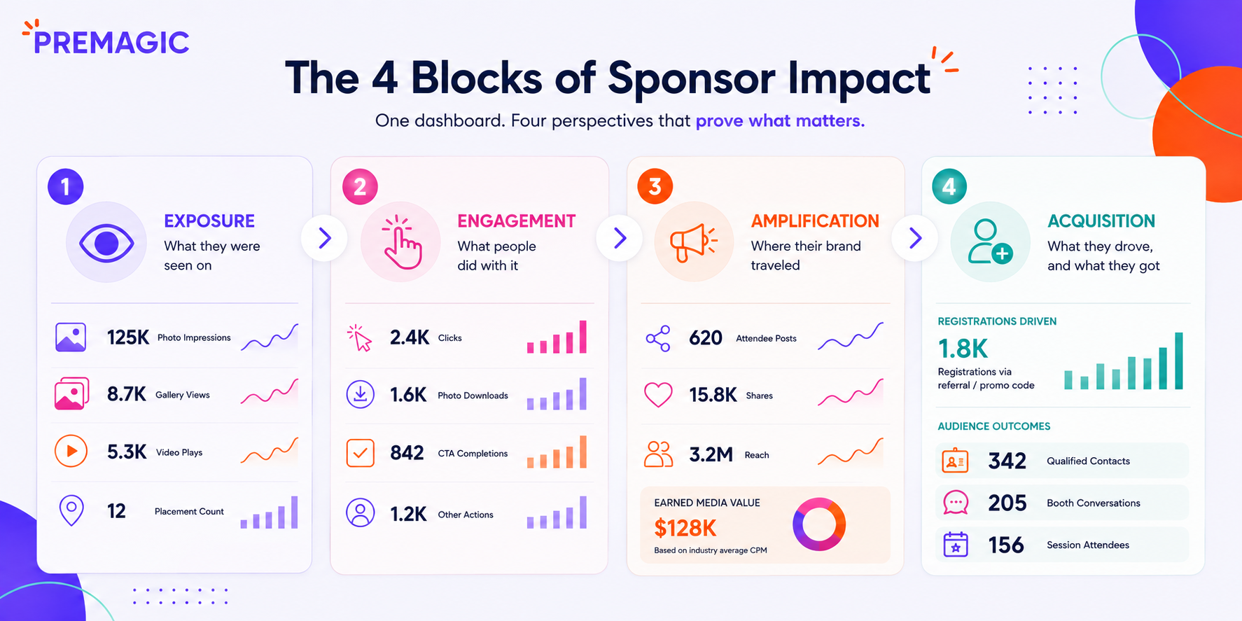
Block 1: Exposure (what they were seen on). Branded photo impressions, gallery views, video plays and placement counts are all useful here. If sponsor branding lives inside your event photo galleries and shared photos, every view can be logged. It's the same mechanism that makes a photo gallery a first-party data source. At the Middle East Event Show, the gallery sponsor's video alone drove 3,506 impressions and 1,119 clicks. The sponsor's director called it the most visible branding they'd done at any edition, precisely because it was countable.
Block 2: Engagement (what people did with it). This is where you move beyond eyeballs and show behaviour. Include clicks on sponsor content, branded photo downloads, CTA completions and other actions that show people interacted with the sponsorship. Finance teams can do more with these numbers because they describe an action, not just potential exposure.
Block 3: Amplification (where their brand traveled). Attendee posts carrying sponsor-branded photos, share counts and the reach those shares earned show how far the sponsorship travelled beyond the venue. This exposure wasn't bought at media rates, and it can keep building after the event ends. To put a currency figure on it, calculate the earned media value of those shares and state your assumptions. Only include it if it's tracked; a vague “great social buzz” line can undo the credibility of everything else in the report.
Block 4: Acquisition (what they drove, and what they got). This section has two sides. First, show registrations attributed to the sponsor's own promotion through its referral link or promo code. Then show the audience outcomes the sponsor was looking for, such as qualified contacts, booth conversations or session attendance from its target segment. Platforms like Premagic can generate these four blocks from the same dashboard, per sponsor. That makes a big difference when you're reporting for 40 sponsors instead of one.
Close with a year-on-year comparison once you have data from a second edition. Renewal decisions are often trend decisions, so showing how sponsor performance has changed can be more useful than presenting a single year's numbers in isolation.
What to leave out
- Impressions estimated from attendance. “8,000 attendees walked past the banner” doesn't tell you whether they noticed it. If you can't measure the exposure reliably, label it clearly as an estimate or leave it out.
- Undifferentiated photo dumps. Ten curated, captioned photos of the sponsor's activation are more useful than 200 raw images.
- Your event's overall success stats. Total attendance and NPS can provide useful context, but they shouldn't take over the report. The focus should stay on the sponsor's outcome.
The timing trick nobody uses
Send the report twice. Start with a preliminary version within 72 hours of the event closing, while the sponsor's internal debrief is still happening. Then send a final version around 30 days later, once you've collected the long-tail numbers such as gallery views, downloads and amplification that continued after the event.
The second report lands at a useful point in the renewal conversation, with numbers that have grown since the sponsor last looked. Instead of simply repeating the post-event snapshot, you're showing how the sponsorship continued to create value after the event ended.
The uncomfortable truth about sponsor churn is that sponsors don't always leave because the event underperformed. They can leave because nobody could clearly prove that it performed. Instrument the exposure, structure the report around counted behaviour, and the renewal conversation becomes much easier.
Want sponsor-facing analytics generated automatically from your event galleries? Why don't you try a free demo?